Tag Archives: responsive

Loading
loading..
website value

Top 7 Things to Do Now to Maximize Website Value

What do I mean by “maximize website value?” I mean now is a good time to look at how to maximize the business value of your website.

I recently needed to shop for new homeowner’s insurance on my home island of Kauai. Being a digital marketing guy I started searching with Google for who might be local agents that I would want to speak with. I was surprised to find that not all local agents had a website. I was also surprised to find that some gave no information on their website as to whether they could assist with the type of insurance I was looking for. And even more surprising was that some of the websites failed to have basic contact information, like email, phone, and address!

I assume that if you don’t have accurate contact information on your website then you may not be a very professional agent to handle my insurance needs. (One insurance company that did have a professional looking website asked me to leave a voicemail for a return call and they didn’t call me back for over two weeks!…..but that’s a different business issue….)

So if you are a small business without a website, the number one thing to do is to get one. You are missing out on new business!

If you do have a website, it’s a good time to check over updates you may need to make to maximize its marketing value to your business. You may have spent money to have a website that really isn’t driving business value. Here I have compiled what research and my own personal experience have shown to be the top 7 things you should do now, if you haven’t already. Now is the time to check the list and make any updates!

1. Content is up to date, accurate, and informative

Does your website clearly lay out the value proposition for your prospective customers? Does it clearly communicate the benefits to them of doing business with you? For example, in my business a web design is not a benefit. Being found online and growing your client base is a customer benefit.

Does your website clearly communicate what differentiates your company. Why should a prospect do business with you versus your competitors?

Does your website make it easy and clear to contact you via email, phone, and social media? Does it have your address if you serve customers at a brick and mortar location?

Does your website have lots of photos? Most people don’t read very much. They are scanning and absorbing visual information before they may read any text. Are you posting to a blog on your website that helps to provide insights and demonstrate your expertise in your particular business? It also signals to search engines that you are a relevant and up to date source for key words related to your business. It’s a business blog, not what you had for breakfast or the fun thing you did on Saturday night.

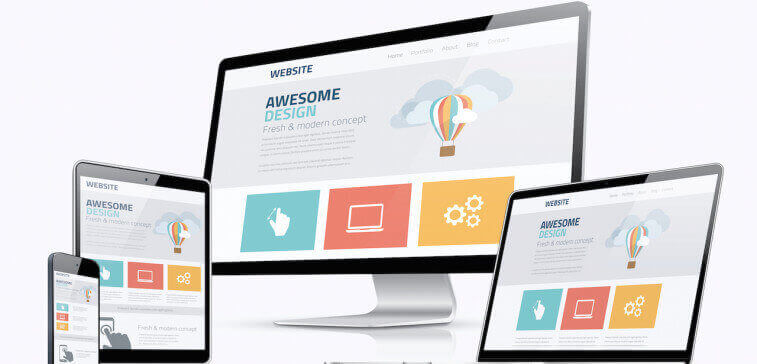
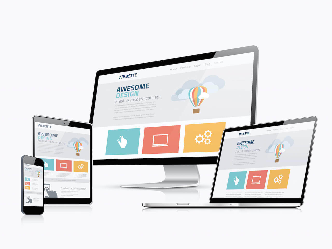
2. Responsive for mobile devices

Half of all Google searches are done on mobile devices. More than 60% of emails are read on mobile devices. Younger generations live on their mobile devices. Your website now should be using responsive technology to adapt to various devices.

If you are found in a search, but your web page is not easily readable, your prospective customer may just move on to the next company. And Google has started to tighten down and penalize some pages in ranking if they are not mobile-friendly. Expect that to get even tighter in the next couple of years.

See my related blog posts: Mobile First Marketing, Responsive Web Design Critical to Your Bottom Line, and How to Avoid Mobile Website Meltdown.

3. It is easy to find information and navigate your website

If your website still looks like it’s 2010 or before, you’re cheapening your brand image and dissuading potential customers from contacting you. The look and feel of websites is evolving. If you haven’t already, it’s time to declutter. White space is in! Focus on relevant images and key information. Make it simple, clear, and relevant. Your menu and navigation should be simple and easy for people to follow.

4. Social Sharing should be enabled and easy to use

Your website should be the content hub about your business. Social Media is a channel to help drive prospective customers to your content. And it should also be easy for people to share content from your website to social media. They will actually help you to market and spread awareness with their family and friends if they find interesting and useful content and an easy share button.

5. Email capture

Someone who visits your website today may or may not be ready to make an immediate purchase. But they have shown interest in your brand. Give them an incentive on your web page to opt-in to your email list. If you offer them some information of value in return for opting-in, you will see a much higher signup rate. By opting-in they are giving you permission to market to them over time in a personal way. They are much more likely to open your email than they are to see one of your social media posts.

6. Speed and performance should be optimized

If your website is too slow to load, you may lose a prospective customer. There is a trade-off between lots of images that tell your story and the speed and performance of your site. A tool set like Google PageSpeed Tools will analyze your speed and give specific recommendations for improvement. Make sure you are using a web host with adequate performance relative to others. Also make sure that all images are highly compressed.

7. Optimize for search engines

Check Google Search Console to make sure there are neither errors nor resource blocking for your site. Follow best practices for focus keywords, titles, snippets, photo alt text, and text so that search engines will recognize and reward your valuable content with higher rankings. Reach out to other relevant high value websites to request a link back to your site. Create relevant links between different pages of your website. Make sure your address and contact information are consistent across all sites and social media. Search Engine Optimization experts may chuckle at this simplified list, but these are good first steps to address or to discuss with your web designer.

Maximize website value

If you started the new year without updating your marketing plan and checking the health of your website, now is the time to maximize website value!

responsive web design

Responsive Web Design Critical to Your Bottom Line

Have you re-designed your web site in the past couple of years? If not,  you are likely in urgent need to update it to a responsive web design. If you’re a digital marketing person, you already know what that is. If you’re not, you may be wondering what I’m talking about and why I say it is critical to your bottom line.

Why Responsive Web Design Is So Important

A while ago I shared data on the shift of consumers to mobile devices to find information. I blogged about it in Mobile First Marketing. I also blogged about what I called Mobile Meltdown Day earlier this year when Google was updating their mobile search rankings. (Others called it Mobilegeddon.) Mobile Meltdown is just beginning. The reality of the initial impact was less than expected. About 17% of non mobile-friendly sites saw their mobile search ranking decline significantly from page 1 results. But that shouldn’t make you complacent about mobile-friendly sites that use responsive web design.. Mobile searches are already over 50% of total searches and continue to increase.

Failure to make responsive web design a priority will put your business at risk moving forward. You will be missing out on customers if they do not have good experience with your web site on mobile devices. In the short-term they may continue to find you in search results. But they will likely abandon you when your site is shrunken, un-optimized, unreadable, and difficult to use. Depending on your business and the typical age ranges of your customers you may already be at risk of losing new customers. The potential impact to your bottom line is huge.

What is Responsive Web Design?

I primarily use three different devices for accessing information on the Internet. I have standardized on Apple (don’t get me started on my poor experiences with past Microsoft products!). So I use an iPhone, iPad, and Macbook Pro at different times and locations. At work I am using my desktop browser(s) on a large screen. If I’m relaxing in the family room, I usually have my iPad open checking social media, reading news, using apps, and searching for information using the browser. If I am not at home I am using apps and searching for information on my iPhone while I am on the move. You may have fewer or more devices than me, but you get the idea. No matter what device size I am using I want to be able to read and interact with information from your business. If it’s unreadable, too slow, requiring me to go to a separate mobile site, or otherwise difficult to use, I just go to the next of your competitors. I personally don’t have time or patience to deal with your business if you don’t make it easy for me to learn about or find you. And I’m not alone!

Responsive web design is the approach to deal with this situation of multiple devices to have a consistently satisfying customer experience. It is a way of designing and developing web sites so that they are easy to read, interact with, and navigate across a wide range of devices. It is an approach for your web site to adapt and adjust to the customer, based on which device they are using at the time. There should be minimal re-sizing and side-to-side scrolling required. Mobile customer experiences should be optimized for speed and for minimal page switching.

How You or Your Web Designer Implement Responsive Web Design

You may use tools or frameworks such as Webflow, Bootstrap, Foundation, or Skeleton if you are Web developer into the technical details. For a WordPress-based web site, I like to start with a theme that already incorporates principles of good, responsive design. That way I can focus more on the customer experience and compelling marketing content.

Principles and best practices continue to emerge for Responsive Web Design, but these are some to consider now:

  • Start by designing for the mobile customer
  • Use images that are flexible and workable on retina displays from small to very large
  • Compress images and videos to improve performance
  • Get rid of non-essential content and site decorations
  • Present more information that can be seen scrolling downward rather than requiring a lot of back and forth between pages
  • Get rid of Flash on your site
  • Minimize navigation menus
  • Have important information at the top of your site
  • Use bigger buttons
  • Look at whether you should have an app in addition to a web site

Small and mid-sized businesses are particularly lagging in the move to responsive web design. If your web site is not yet using responsive web design it needs to be on your priority list of things to do. You’re probably already losing some customers who are trying to interact with you on mobile devices. But this will increase significantly over the next 1-2 years. The time to act is now before you see a negative impact to your bottom line.

Please sign up to receive a weekly email of updates to the blog. And please share this on social media with others who may be interested.  You can also follow Kauai Digital Marketing on Facebook, Twitter, and LinkedIn.

Let me know any comments or questions.

mobile website

How to Avoid Mobile Website Meltdown on April 21…and Beyond

It’s almost here! I’m calling it Mobile Meltdown Day. April 21 is the date that Google will lower your web page rankings if your site is not deemed by them to be mobile friendly.  Some big brands and lots of smaller businesses may wake up to a surprise on April 22 unless you take action now. Google announced this change in a blog post on February 26. It may only impact your mobile search rankings for now, but there is widespread speculation that it may also affect desktop search rankings later.

What are Google's goals?

Google isn’t making this change just to make work for your business. More and more of your and Google’s customers are shifting their time and attention to mobile devices to search for information and interact in email and social media. As Google wants to maintain their dominant market share for search, they have some goals they are trying to achieve with this change:

  • Have a better mobile search experience for their users
  • Give their users exactly the information they are looking for in the most usable format
  • Make money – they will be seeking to expose apps and media in search results on mobile devices

Why is this important to your customers, not just Google?

In a July 2012 study conducted by market research firms Sterling Research and SmithGeiger for Google they found:

  • 67% of smartphone users say a mobile-friendly site makes them more likely to buy a company’s product or service, and 74% say they’re more likely to return to the site later
  • 61% say that if they don’t find what they’re looking for (probably within about five seconds), they’ll click away to another site. Half say that even if they like a business, they’ll use its site less often if it doesn’t work well on their smartphone
  • 72% of users say a mobile-friendly site is important to them

How do you know if you are at risk?

  1. Look at your website on a smartphone. Does it appear cut off on the screen? Do you have to scroll left or right? Is the text so small that you have to pinch and zoom to read anything?
  2. Run the Google Mobile-Friendly Test by entering your URL.

What can you do?

Chances are good that if you have not updated your web site in the past few years, you are at risk.

If your website is based on WordPress, you can convert to a responsive theme that will detect and adapt the display for different types of mobile devices.  Look for a responsive theme that enables you to follow mobile design best practices.

Here is my top ten list of mobile best practices:

  • Do not require any scrolling right or left
  • Make it easy to find your location and operating hours
  • Use bigger buttons
  • Enable finding important information in one or two clicks
  • Create a simple home page with a short menu
  • Highlight your site search so customers can quickly find information on your site
  • Add a click to call button
  • Simplify data entry for forms and minimize typing – use drop downs and choices to select
  • Don’t require customers to pinch to zoom to be able to read the text on your page
  • Keep the user in a single browser window

Are you ready for Mobile Meltdown Day? Have you tested your company’s web site? Have you at a minimum put an action plan in place to become compliant with Google’s mobile friendly policies?

Are there other mobile best practices that you have identified?  Please share in comments so we all benefit.

If you have found value in this or other blog posts please also sign up for our email newsletter to keep up with the latest updates.


pinterest marketing best practices

Aspiring Women: 14 Pinterest Marketing Best Practices

Pinterest recently completed another round of funding that values the company at $11B.  This is a hefty valuation for a startup that only began selling display ads in January. But growth and demographics have been very attractive. It had been a U.S. growth story, but the number of users outside the U.S. grew more than 135% in 2014.

Pinterest outperforms Twitter and LinkedIn in the time spent on each network. Bing includes Pinterest images in search results. Pinterest has become an important global marketing social media platform.

This is where women go to explore, express, and share their aspirations. 80-85% of users are women and this has been holding steady as the platform grows. 92% of all pins are posted by women. Also, almost half of Pinterest activity happens on tablets.

And Pinterest is one of the fastest growing platforms among millenials. While the average age of users is 40, this is the place to be to reach the desirable group of women buyers who are under 40.

The most pinned categories by women include:

  • Food and drink
  • DIY and crafts
  • Home decor
  • Holidays and events

So what are some Pinterest marketing best practices to optimize your investment?

  1. Create and name boards using aspirational language of your target audience – Don’t just create a board for each of your products or product categories.  Post interesting content.  Use aspirational titles like Luxury Spa Bathroom or Dream South Pacific Vacation or Easy Ways to Delight Your Family that will match the searches and aspirations of your target users.
  2. Show a human side to your company – Make it personal. Create a board about your team or your company values and culture.
  3. Use unique images that will capture your audience’s attention – As the user scans over images, make sure yours stand out and catch the eye.
  4. Find the images that capture the most attention and make them cover images for your boards – As you collect data about the most pinned items, look at which images are gaining the most attention and use them as covers for your board.
  5. Don’t push sales, but do include a call to action in your Pins and link back to further information – Users don’t want a product sales pitch. They want interesting content. But be sure to have a link for further information that they can click.
  6. Pin video and audio – 2015 is the year of video on social media.  Try some video Pins to capture attention and to show a 3D view or further explanation.
  7. Use “Pin It” and “On Hover Pin It” buttons– with a few lines of code from Pinterest inserted on your web site, users on your site can pin or hover over your images and easily share them on Pinterest. Pinterest provides the Javascript to do this easily.
  8. Add context with Rich Pins – Add additional information to pins for apps, recipes, articles, movies, products, and places.  For example, a place pin can include extra information like a map, address, and phone number.
  9. Use hashtags – Hashtags can help you be found in searches, but limit yourself to one or two key ones.  Don’t overdo it.
  10. Be social –  After all, it is social media. Be responsive and show appreciation to others. Reach out to others to follow them and comment.
  11. Use Pinterest Analytics – Look at the data for which of your pins are most engaging. The images with the most re-pins and clicks are the ones to use for the cover of your boards. This also tells you where to put time and effort for creating new pins.
  12. Join Group Boards – Participate in Groups, but don’t just self-promote. Too much of that will be a turn off. For help with which Groups to join, Pingroupie is a tool that can help to search and sort groups.
  13. Run a contest to generate some buzz – A Pinterest contest can help draw attention and sharing.
  14. Promote Pins with pay per click advertising – Pick pins to promote, specify a target audience, and pay per click for users that click through to your web site.

Don’t forget a couple of other marketing best practices:

  • You can use Pinterest for competitive research. What are your competitors posting and getting engagement with? How can you improve your value proposition and differentiation?
  • Cross-promote between Pinterest, your web site, and other social media platforms. Drive complementary engagement across the platforms where your audience can learn more, share more, or take action.

Are you marketing on Pinterest? Do you agree with these best practices? Have you found other Pinterest marketing best practices?


web design company choice

How to Hire the Right Web Design Company for Your Business

Hiring a web design company that fits you and your business is key to your success. You’ve heard the old saying, “you only get one chance to make a good first impression.” That stodgy old proverb is as true in the internet age as it was before the advent of computers. So far as the website user is concerned, the face of the company is that website they see when they surf to your URL.

The website, how fast or slow it is or what it has to offer, is the only thing that they know about your company. It’s representing you. How do you hire the company that is going to design and create that site? In short, how do you hire the company that is going to be responsible for the growth and success of your online presence?

It may be the wrong decision for you and your company to use the first web design company that a friend mentions or that you see in an ad.

Here are a few tips that may help to guide you in the right direction. As you read these, bear in mind there are exceptions to every rule, but they are few and far between. Make sure before you hire your company that they really are the exception.

Review sites they have created. Check out the sites that they have created and how fast or slow they are as well as how well they work.  You’re looking for quality of work.  Do the sites load quickly?  Do they make use of modern web design trends?  Is navigation simple and clear?  Is it easy to find desired information?  Do they work on mobile devices as well as desktop browsers?

What type of websites have they designed? If the site is designed in custom code, or in code such as Flash ( a very poor choice for SEO purposes incidentally) it’s going to get quite costly for you to have them update the site every time that you require a small change or a photo added. CMS or content management systems such as WordPress or Drupal are the best option. Find out if they are willing to design in this type of platform to allow ease of use for you.

Ask them a few questions about search engine optimization and marketing. SEO is imperative today and knowing something about it means creating a site that will rise more quickly in search. The ideal designer has done at least some rudimentary studies in SEO and can offer you solid insights. Those insights are invaluable when your site is designed. Having the site reflect best practices in SEO from the ground up can make a huge difference when it comes to how well the search engines receive the site.

What other marketing expertise do they offer in addition to web design?  Maybe you only need a designer to execute your vision.  Or maybe you would be better served by someone with marketing expertise who can challenge and add value to your thinking and plans.  Do you have a winning marketing strategy? Do you have a consistent brand across traditional and digital marketing?  Do you have a social media marketing plan?  How will you develop and populate content to your site?  Will you have a blog?  What will you use for email marketing?

How Reliable are They? Find out how long it took for them to create other sites from start to finish. Do you work with the same designer from beginning to end? How responsive were they to the needs of the customer and how long did it take them to respond to questions and concerns regarding the design or the process?

How do they communicate with clients? Do you want someone who can take your vision or brief, go away, and come back with a completed product?  Or do you want someone who can discuss, iterate, and review with you the direction of the project and make any mid-course changes or corrections?  How often will you hear about and see progress on your web design?  What will be the checkpoints and milestones for you to review and approve?  How will changes to the original project be handled?  Do you feel comfortable with the amount and style of the communications?

Check references. A good web design company –even if they are relatively new in the web design business– will be able to offer you references from both individuals and businesses.

The Cost of the Work. Other considerations in choosing the right company will of course be the price. Is it fair and how closely does it fall into line with other designers. Regardless of where you are located, the designer should at least be close in price to other designers in their area and of their experience. If they are a great deal higher, it may be that they are far more skilled, or it may be that you’re paying for the name and not the actual cost of their work. If they are a great deal lower, you should be asking yourself–and them–why that is the case.

Last, but certainly not least, take a look at their own site. Chances are that if they didn’t take great care in selecting the style, designing the layout and creating the text, they aren’t going to do that for yours either.

Taking the time and doing the due diligence that it takes to get a well made website says a lot about you and your company. Unwieldy or poorly constructed websites speak volumes to those who may be considering doing business with you. If your website is going to speak about your company, make sure that it’s saying what your prospective customers want to hear.

Web Design Top 10 Trends

Web Design Top 10 Trends for 2015

Why should you care about web design trends for 2015 if you are not a web designer?  If you have a website that has not been updated for a few years, you not only may look stodgy and out of date but also may be poorly positioned by Google in search results.

If you don’t already have a website, you have a couple of options.  You can use a service for a “free” website (see There Ain’t No Such Thing as a Free Website) or a website generator and be locked into their design choices for you.  Or if you are considering a custom web design these are important items to discuss with your web designer.

Good design is a reflection of your business.  A well designed website can help to differentiate you and engage your audience on an emotional level as well as based on content.  A poorly designed site can cause your prospective customers to move on to your competitor.

I have looked at a lot of web sites and predictions of trends by people in the web design business.  In this blog I boil it down to the top ten that you as a business owner should pay attention to in 2015.

1. Responsive, Mobile First – More than half of all email is now read on mobile devices.  Your mobile web traffic may be a lower percentage for now, but I bet it is increasing every month.  It won’t be long before mobile web access exceeds desktop web access.  If your site is not already using responsive web design to appear on mobile devices, you need to make that a priority now.  In addition, some web sites are now adopting mobile techniques such as hidden or sliding side menus across all devices including desktops.  Mobile will drive more design trends in the future as that becomes the majority of web views.

2. Performance and Speed – If your site takes too long to load on a mobile or desktop device you may lose a prospective customer or annoy an existing one.  Even more importantly performance and speed is part of how Google ranks your site for display in search results.  If your site has not been optimized for performance and speed your page rank may be slipping relative to competitors.  Make sure your web design pays attention to performance and speed.

3. Larger images and less text – We are bombarded with information.  We skim most of the emails we receive and the web sites we visit.  We are scanning for the important points and maybe stopping to read when something catches our eye.  Large images are one way to communicate and to cause the eye to stop.  It really is true that a picture is worth a thousand words!  An image with text or information overplayed may give you a big bang impact.  At a minimum it may draw the readers’ attention to read more.  Less text in your web design, more bullets and lists, and more graphics and infographics are ways to capture attention and transfer information quickly.

4. Video – Video is a powerful medium that is becoming more prevalent on web sites.  Videos can be very effective to tell a story or evoke an emotion.  They are very useful for instructions and training.  They are a way to show a product in three dimensions or a way to provide a demonstration of a product or service.  Think about how a video may be able to communicate more effectively than words or pictures.

5. Flat design and material design – Flat design has been around for a long time in general, but became important in the digital world in the past several years.  Apple’s IOS 7 release in 2013 prompted a lot of attention to flat design.  Flat design is simple web design.  It doesn’t try to make things three dimensional.  It is easy to scale across devices.  It uses simple elements, typography and flat colors.  Material design was announced by Google in 2014.  It is widely used in Android and other Google applications.  It includes increased use of grid-based layouts, responsive animations and transitions, padding, and depth effects such as lighting and shadows.

6. Big typography – Along with simplicity, flat design, and larger images is also the trend toward big typography.  It’s another way to stop the reader’s eye and grab attention.  It screams out “look at me” and “this is important.”  It’s like the old days of skimming a newspaper for the headlines.  It’s simple, clear, to the point, and attention grabbing.

7. Pinterest style cards – Another key trend in web design is a way of making it easy to scan a lot of information quickly primarily using images and “cards.”  Your eye can quickly scan across the cards and titles to see if something catches your eye to stop, click, and drill down.  This is the format on the growing Pinterest social media site.  The blog page on our site is also an example of this trend.

8. Scrolling, not clicking – Users on mobile devices prefer to scroll rather than click to find more information.  As a result websites are increasingly using long pages with scrolling rather than menus and navigation to click through.  Apple’s web page for the iPad Air 2 is an example of this trend (plus others).  Lots of navigation and clicking in web design is out.  Minimal navigation and scrolling are in.

9. Storytelling and emotion – One way to differentiate your company to prospects and to encourage ongoing customer relationships is to tell stories and to create emotional connections.  The testimonial or reference account has always been an important part of the traditional marketing mix.  Customer reviews are another important part of many commerce and travel sites.  Telling stories related to your company helps to create an emotional response in the reader of your site.  The story may be executed with images and text or may be most effective with video in your web design.

10. Modular instead of pages – Related to trend 7, modern web design is also shifting to be more modular rather than going through pages.  Cards are an example of this.  Masonry or tiled layouts are examples of modular web design.  Instead of navigation you are scanning through tiles of images with text overlays to determine where you want to stop and drill down further.  Line25.com compiled a useful post of 25 Web Designs with Modular Content Block Layouts.  My personal blog at kauaiguys.com is another example that uses the Booklet theme for WordPress and is designed to be modular.

Wondering if your site is up to date and effective for your target audience?  When was the last time you updated the format?  Updated the content?  

For a free web site review click here to contact us.

mobile first

Mobile First!

Today it is about being mobile first!  If people cannot access your content easily and clearly on mobile devices, you are missing the boat!  This is true all over, but on the island of Kauai, this can be a literal statement.  I was recently chatting with the owner of a rental shop near the port where cruise ships come in.  He was telling me that he had developed a web site, but he had not thought about it being mobile first.  But his target customers all arrive with mobile devices.  He said, “I see them coming off the ship all looking at their smartphone or tablets.”  The same is true of nearby hotel and timeshare visitors.

Nielson reports that over the past year, the average consumer spent nearly seven hours more per month with their mobile phones, and more than 70% of mobile users use smartphones.

Mobile first email marketing

According to Movable Ink’s Q1 2014 US Consumer Device Preference Report email opens continue to migrate away from the desktop.  In fact, two thirds of emails are opened on a mobile device.   Within that, the tablet share of email opens continues to grow.

Movable Ink said that 66 percent of emails were opened on either a smartphone (47.2 percent) or tablet (18.5 percent) in Q1 2014. That’s up slightly from the 65 percent in Q4. By contrast PC email opens were down to 34 percent.

What an opportunity for online, digital marketing.  This means that your email reaches your target audience anytime and anyplace.  Think about that.  But also think about how it must be designed for the customer on the go.  If you don’t grab him/her with the title and the first five lines of your email, they will move on to the next one.   It has to be attention grabbing, get quickly to the value for your customer, and then to the call to action.  In a previous role, I wrote many such emails to be used by the salespeople in our company.  Many of them were surprised that they got a quick response from a senior executive.  It was because it was targeted at them, designed to be read on a mobile device, with a clearly stated value proposition and an easy call to action.

Mobile First Blogs

Don’t be surprised if mobile devices are soon the primary way that people read your blog posts.  You can use Google Analytics to see how they are being accessed today and what the trend line is for mobile devices for your particular site.  Have you looked at and thought about how someone will access your blog from a mobile device?  Do your sharing icons work on the mobile device?  Can users comment?  Is there far too much scrolling to the right required?

The best way to find out is to test your site on a variety of devices. But Google also provides a website called Make Your Website Work Across Multiple Devices which helps you test your mobile website for mobile compatibility.  There is also a link to their PageSpeed Insights tool where you can test performance on mobile and desktop devices and get suggestions for improvement.

Mobile First Design

How do you get mobile first design?  If you are designing a new web site, make sure your developer is enabling responsive design.  There are many tools and themes available now to automatically enable web sites to be responsive to mobile devices and to optimize the display and performance.  If you have an existing web site that is not designed for mobile, you have a few choices:

  • Do nothing – your customers will have to enlarge and scroll on a mobile device
  • Re-design to be responsive – if your web site is a few years old, it may be due for a re-design anyway
  • Create a separate mobile site – you could have a separate mobile site, but then you have to maintain two sites

Mobile First Features

The rise in use of mobile devices also opens new opportunities to think about exploiting unique features of those devices.  A common example is being able to link to mobile turn-by-turn directions.  Not only can they find your business online, their device can guide them to you.  They can touch the screen and immediately call or email you.  They can check back in with you during the day and at different locations.  You may also want to make use of location awareness to push certain information or promotions.  And mobile devices are also good for social media integration.  Making it easy to share on social media directly from a mobile device may increase your reach.

So it really is a new world.  I now carry the Internet in my pocket via my smartphone.  When I travel, I stay connected with my tablet to use in the airport, on the plane, and in my hotel room.  I may search for information about a business anytime and anywhere that I have a connection.  If you are not mobile first, you are missing the boat! (maybe literally!)


Layout mode
Predefined Skins
Custom Colors
Choose your skin color
Patterns Background
Images Background